Performance Metrics – Their Content and Structure Can Have a Major Impact on the Results Achieved
A performance metric – any measurement used to gauge an organization’s performance in a specific area (usually important area) and is updated routinely with new data.
Data can tell a story; unfortunately it’s often not formatted to ensure everybody sees, understands and acts on that story. In many organizations, especially those with poor performance results, the story is buried deep within the data set. Poor data displays and practices hide the story in the data. For example:
- Stoplight colored cells in spreadsheet metrics (It’s so simple there are only three categories of performance?)
- Goals scoffed at by the teams
- Executives viewing different data displays than the rest of the team
- Metrics emailed to select team members
- No data distribution in important areas of performance
Shortcomings like these are squandered opportunities to get your team focused on performance results. The good news is that with today’s technology, every company can access the tools needed to create data displays that leave no doubt where each team should be focused to achieve results. Metrics that make the story in the data easy to act upon have many important characteristics:
- Graphical representations of results (newspaper graphic simplicity)
- Web page visibility to the entire organization
- Performance displayed against prior periods and/or benchmarks
- Categories of overall performance displayed, actionable categories – with trends visible for each (making it easy to tell which are getting better or worse.)
- Performance opportunities identified in each actionable category with a meaningful benchmark
- A team action list maintained next to the performance displays. Each action identifies the actionable category it is intended to address
- Organizational performance cascades for each metric, in which results roll up to companywide performance and each level’s results a click away
- A feeling of team ownership with each update interval. A team should be proud to display positive results to the organization (or chagrined if they continue in the wrong direction.) The ideal metric becomes a focal point; almost any discussions about its subject matter results in a glance at the site for the most recent facts
- Easy to maintain and update
- No special tools required and it’s easy to deploy on an existing data set
A metric with these characteristics tells a performance story to the entire team. Each team sees and understands where the opportunities lie and knows who is leading the actions to address them. A metric with these characteristics creates focus and accountability.
A Metric That Tells the Story in the Data
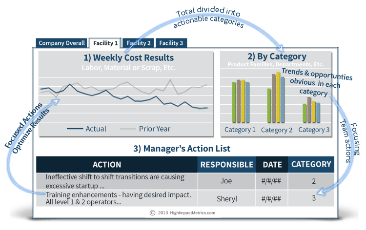
Illustrated below, a generic cost metric with the content, format and structure that makes the story in the data easy to comprehend (and exhibits all the important characteristics previously stated.) A similar format could be used for working capital, revenue, quality, supply chain, or other areas.

Illustration No.1
The Three Components and the Critical Thinking that Make Them Effective
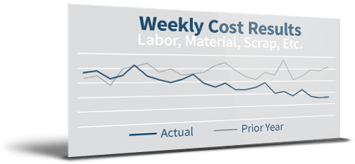 1) Overall Results (Illustration No. 1 – Weekly Cost Results)
Overall performance is displayed in a line graph with comparisons to a prior period and a meaningful benchmark. It’s not that different from a typical metric display, and is self-explanatory.
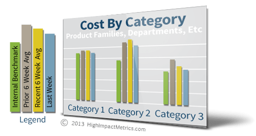 2) Actionable Categories Chart (Illustration No. 1 – By Category)
This chart does the heavy lifting. Categories of the overall metric – not just any categories, but actionable categories, are the foundation for team focus.
A Typical Legend
The bar on the right depicts the team’s prior week’s result. The two bars in the center are used to tell if things are getting better or worse. Comparing the bar on the left to current performance identifies the size of the performance opportunity in the category. (The time frame displayed is adjusted to fit the metric.) Once the team is familiar with the legend, a glance is all it takes to know how things are going.
Here are some examples of actionable categories in a variety of performance metrics:
- Material Costs – Product Family A, … B, … C
- Labor Cost – Line One Direct, Line Two Direct, Indirect
- Production Inventory – Age: 30/less days, 31 to 60 days, 90 days or more*
- Production Inventory – Allocated to Jobs, Stocking, Excess, Rejected
- DC Out of Stocks – System Inventory Incorrect, Sales in Excess of Stock Levels, Supplier Past Dues
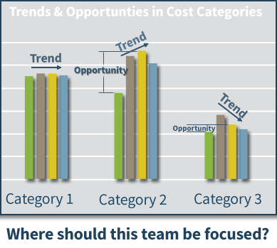 *The text with the strike-out is an example of non-actionable categories. While a display of inventory ages may be interesting it’s going to be difficult to make meaningful changes with the information. In this case, the categories have to be actionable from the material planner’s standpoint.
For an effective metric, actionable categories are not optional. While many processes have such data, if you don’t have it, work to obtain it. Teams must know where they should be focused, don’t assume they know. Make it obvious to the entire organization.
Meaningful Benchmarks (the green bar in the legend)
A meaningful benchmark creates accountability and helps ensure you obtain team buy in.
Best in Class benchmarks are useful for multi-facility operations that produce similar products or services. Displaying an average of the best performance levels in the organization is an appropriate benchmark. Use the best sustainable, current level, (don’t use the best level ever attained, a one-off event won’t motivate anyone). Work mix or capital equipment differences can impact comparisons, but before factoring them into the benchmarks be sure they are thoroughly understood by the organization. Benchmark adjustment factors chosen with little care can toss accountability out the window. Once performance starts leveling out between facilities, the race to be first among the best managers keeps the benchmark relevant.
Planned levels of performance, quantified with data, make the best benchmarks. They are effective with inventory metrics in job shop environments where inventory can be a moving target. For example, in a multi facility operation each facility’s unique inventory can be affected by different customer and vendor variables. Though beyond the scope of this article, an Excel App can be created that allows each facility to quickly calculate an “average” planned level, based on the “knowns” in the variables. Update the calculations regularly or when a major business change occurs. Voila! Accountability. The plan is compared to actual levels at each metric update and the action list identifies materials causing gaps to the plan.
Other benchmarks can include external benchmarks, if available, or performance goals.
Cascading Categories
A linkage between performance levels is essential to keep everyone pulling the same direction. An executive’s interest in a critical area of performance should be aligned with those “on the floor.” The category charts help achieve this structure and keep every level focused at their level of control. With a separate tab (noted in Illustration No. 1 as Company Overall, Facility1, Facility 2, and Facility 3) for each level’s performance, cascading categories can be structured as follows:
- At overall company performance the categories could be each location/facility.
- At the facility level the categories could be each shift.
- At the shift level the categories could be product families, work-cells, operation numbers, etc.
Each level has a metric owner assigned with the authority to make decisions that impact results. It could be an Operations VP at the Company level or a GM at the facility level.
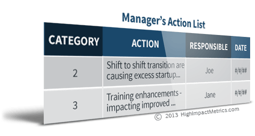 3) The Action List (Illustration No. 1 – Manager’s Action List)
Immediately below the performance displays is the action list, completely customizable to fit the subject. Just make sure there’s a cell that calls out the category the action addresses – so anyone can confirm the actions are focused correctly. And depending on the organization, the action list may exist at the facility level but not at the shift level or vice-versa, allowing complete flexibility to meet the on-going needs of the organization. Continuous improvement personnel can help ensure the actions are addressing the root causes of the opportunities identified in the graphics. For the purpose of illustration, the action list shown has been kept very simple.
Like the graphics, actions lists are visible to the entire organization.
A Cycle of Continuous Improvement – Created by the Three Components
I call metrics with this content, format and structure High Impact Metrics.
As shown in the first graphic, the three components of a High Impact Metric create an ongoing cycle of continuous improvement. But did I mention the key to results is actionable categories and meaningful benchmarks?
This approach doesn’t require companywide roll-out or training. Train those involved in the metric’s processes; since they are intuitive, training needs will be minimal. This is a low overhead approach to performance improvement that drives results with facts – no hoopla needed.
Everyone, from the C-suite to the factory floor, can use the site to check results and actions. And it will eliminate non-value added reporting since everyone has access to the latest information and actions underway.
High Impact Metrics – The Nuts & Bolts
Microsoft Excel and SharePoint are the primary tools used to create a High Impact Metric.
Excel creates the graph and charts. It’s capable of producing professional looking graphics, but don’t rely on its canned formats. In fact, since these charts will be viewed regularly by the entire organization it’s worth a small investment in some help from a graphics designer to select colors and styles that integrate with the organization’s brand. The more professional they look the more they will be “respected.” Excel can export charts and graphs to SharePoint each time a file is saved; you’ll need that capability for a High Impact Metric.
Structuring the data for ease of use is important too, though it may take some “advanced” data manipulations. Keep the user in mind – use macros and VBA programming if necessary to eliminate repetitive tasks. Structure it so users don’t change the chart’s data selection at each update interval. Link the files/worksheets so the upper organization levels draw the data from the lower levels. There should be no data entry required for generating upper level displays. Use ODBC connections and pivot tables as much as possible. Lock down cells and formulas to prevent problems and errors. Dedicated spreadsheets used for a High Impact Metric will be considered an Excel App; they won’t be used for any other purpose.
SharePoint, as I mentioned, can display Excels charts and graphs. And lists? SharePoint is a master of lists, so create your action list directly below the Excel displays on the site. Provide appropriate access and permissions to those performing data and action list updates. And like the graphs being displayed, have a graphics designer make suggestions on site colors and styles. This shouldn’t cost much and it will be money well spent.
Establish rules about updates, such as what time and day of the week or month they should occur. Then start expanding the site. Post your S.O.P.s and success stories there. If the organization is large enough set up a forum to discuss results and help spread best practices.
With these tools you are free to adjust anything and everything as needed with respect to team changes. Each level’s appearance and content should remain consistent throughout a single metric; one department should not make format changes at their single level. With High Impact Metrics, you’re not working under the limitations and formats of a metrics software/dashboard package. And unlike metric software that’s linked to ERP, you can add relevant data that may not exist within it.
If you’re on a tight budget you can create a High Impact Metric with Google Sites and Spreadsheets, but the appearance and functionality won’t match Excel and SharePoint.
Focus and Accountability Drive Results
Even in organizations with poor performance, the talent for improving results often exists, but it’s squandered when teams aren’t focused correctly. Only management can create a fact-based environment that fosters focus and accountability. High Impact Metrics are ideally suited to supporting this objective in critical areas of performance.
Search “High Impact Metrics” on YouTube.com and you’ll find a couple of case study videos that describe this approach in more specific cases and the benefits they created.
By Marty Preuss
 Marty Preuss founded High Impact Metrics, LLC to promote performance improvement with the fact based approach described in this article, see HighImpactMetrics.com. A Mechanical Engineer with certifications that have included; ASQ Quality Engineer, ASQ Quality Manager, Sigma Breakthrough Technologies Six Sigma Black Belt and APICS Certified Supply Chain Professional, he has experience in a variety of industries. He is considered an advanced Excel user and relies heavily on that ability to efficiently and effectively manipulate data – maximizing its value for user insight, decision making and automation of routine tasks. With a practical approach, he focuses on the facts, engages team members and works to raise a team’s abilities with creative problem solving and often, Excel Apps that contribute to the on-going solution.

